#Howstrump?
A comparative analysis of social media data from China and US on the subject of Donald J. Trump´s presidential campaign The United States of Twitter / The People's Republic of Weibo
Why Trump?
Donald J. Trump announced he was running for President of the United States in June 2015 with controversial and racists comments towards Mexicans. At that time Trump`s candidacy was a joke, a wonderful source for memes and other internet jokes. After the Mexicans came the Muslims, women, persons with disabilities, and also China. In May 2016 Trump was elected the Republican Party`s candidate to the presidential elections, proving that many people in the United States are moved by his racist and hateful speech. He argues that China is raping the United States and accuses her of manipulating the Yuan to make its exports more competitive on the global market. In order to “Make America Great Again” Trump is proposing the following strategies among others:
Check his position towards China here
Those are strong affirmations that usually would cause diplomatic conflicts between countries,
or at least reject from the attacked country population. However, people in China seems to
admire Trump. According to the BBC article “Donald Trump and China: A complex relationship”,
by Vincent Ni and published on the 26th March 2016, Trump is a well-known name in China. He
is admired for being a wealthy businessman. Many companies even use the name Trump in
order to imply that they are trustful and successful as he is. The article affirms that “There is no
reliable opinion poll on how Mr Trump's comments are received in China, but state media are
watching him with a degree of schadenfreude”.
The purpose of this data gathering, analysis and visualization exercise is to gain a better
understanding of Chinese people`s attitude towards Trump, and how it has evolved with time.
Social media is therefore the best way to collect data from, since it gives a place to reflect the
people`s opinion and a certain degree of anonymity that allows freedom of speech. The
following hypotheses will serve as a guiding line through the process:
- People in China are interested in Donald Trump´s presidential campaign and react to it on social media
- The conversation around Donald Trump`s campaign revolves around some controversial ideas (like the Mexican border wall, expelling the Muslims, etc.) while “boring” but non less important points of his campaign are ignored
- Trump`s statements regarding China influence the perception that Chinese people have of him
Data Mining
Weibo and Baidu
Why chose Weibo as a representative social media in china? Weibo is one of the most commonly used social software in china, maintaining a tremendous amount (around 200 million) of active users. Compares with similar products like RENREN or QQ, it involves the most popular topics (update every 10 min) happened in this country and with its users most between the ages of 17 of 33, Weibo has dynamic and powerful social influence. So, collecting data from Weibo can make sure at least 2 points: 1. Every latest news about Donald Trump can be seen 2. A lot of different voices can be heard. | See chart of diagram representing weibo users
Which keyword to search?(#特朗普)There are generally 2 options when you search something about Trump on Weibo, keywords or topic titles. Since getting all the topics related to Trump is relatively difficult for people who is not so familiar with him, keyword became our best choice. Different from twitter, Donald Trump has many versions of translation, official account like Sina News use“特朗普”, while some people call him “川普” as a nickname. In order to get data from both individual and official accounts, “特朗普”is our final decision for keyword.
From when to when?On June16, 2015, Trump announced his candidacy for president. This day can be considered as a milestone, before that not so many people in China knew this billionaire. So the beginning of our searching period was selected at the particular date. Since the process can be applied to other social topic researches, it will be better if we can get warm data (it might require more coding skills). Due to technical and time constraints, the end of searching period is 2016.5.4 (the end of data collection part of the class)
How to get the data?
Aimed to see the pattern of social media’s respond to Trump, a well-structured database need to be established, including user’s name, content of microblog, update time, numbers of thumbups, followed and comments (all of them can be seen in a single Weibo). A web spider named Gooseeker maybe the best choice if you want to get data from Weibo without coding. The rule of Gooseeker is to get what you can see. It just like you copy the information from Weibo advanced search, so the limit is only hottest and newest tweets can be seen. The simple and efficient way to fix it is to separate searching period into months, then all information will be available.
ResultsGooseeker provided a highly structured data format, all you need is to change the string data into other forms and delete some unnecessary information. After that, you can have a neat database.
For covering US opinions and reactions about Trump, the micro-blogging platform Twitter was chosen. Since its launch in 2006, Twitter has changed from mainly covering personal events to being a worldwide platform for sharing and discussing news, including politics. Twitter’s user base in the US is roughly 60 million1 monthly users. Several nations-wide news companies utilize the platform for spreading their stories, resulting in Twitter collecting both personal and professional opinions. Twitter was searched using the search query “#DonaldTrump”. Through qualitative text analysis this was concluded to be the classification most commonly utilized for tweets (a post on twitter) discussing topics related to Trump. The choice of omitting similar search queries, such as “#trump” and “Donald Trump”, was made to get better control over the data. Manual sampling of our data suggested that “#DonaldTrump” covered both democrats and republicans and a wide range of topic. The public API of Twitter sets certain limitations on data queries. Only data from the last 6-8 days is available. By periodically running searches, data from 10 days was collected. Due to this limitation, comparisons to Sina Weibo were focused to this period of time. Other means of accessing Twitter data are not publicly available and thus not suitable for this study.

Collection, filtering and sorting and classification of Twitter data was done using R, with “TwitteR” (public API access), “SentR” (sentiment classification) and “TM” (text mining operations) packages. “Twitter” returns a list of tweet information, including: text, user id, whether or not it is a reply, favorite count, retweet count, whether or not it is a retweet, geolocation and creation date. To do text analysis the “TM” packaged was used to remove stop words, links and emoji in order to normalize the text. Sentiment classification was done using the “SentR”. Finally, all data was put together using Excel.
The resulting dataset consists of statuses for 10 days, 2016-04-25 to 2016-05-04 with an average of 1800 per day (including retweets). As retweets cannot be counted as individual opinions, these were removed from the dataset. The resulting dataset consists of 2846 statuses.
Data Analysis
Sentiment Analysis from Weibo
It´s always so hard to describe a feeling. There are several methods on internet telling how to do it with coding. Basically, it working with a dictionary which store positive words and negative word separately. Then, go through the text to find words that matching in the dictionary. The last step is scoring the text based on counting numbers of words of each type. In terms of Chinese, things get more complicate, unlike English Chinese words stick to each other in one sentence, which means the coding can’t work with Weibo content. Luckily, professor Shen from Qing Hua university created a software named as ROST, it can separate words can give sentiment scores. (Since the code of ROST is not open to the public, the principle of scoring still remain as a black box to us)
Something about Weibo (images below are produced with Tableau)
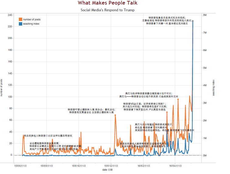
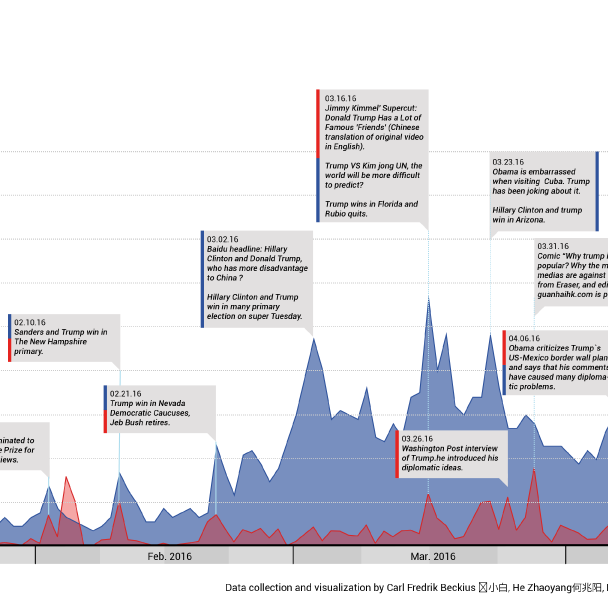
Q1:What makes people talk? In order to find the event that triggered the heat talk on Weibo, number of posts and searching index from Baidu (biggest searching engine in China) are compared, attached with big news about Trump. We can easily find the common tendency that people show an increasing focus on trump and both curves have sharp fluctuations. We just compare the peak points of every month between the two curves. According to the day of events, we check the specific contents of Weibo posts and the news of Baidu to see what happened on that day. We found that if they both have peak points. The events are always the same and mainly involve speech about China or some interview of trump or the results of primary elections. But Weibo curve shows some funny video of trump can also cause peak points, just like what happened on 10th July and 10th September. This phenomenon can show some kind of difference between public media and social media.
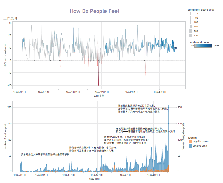
Q2:How do people feel? The picture on the top is using the median of sentiment score each day (to avoid the extreme cases), red is for negative feelings while blue for positive, thickness of the line is according to the amount of total posts that day. Second picture is based on number of 2 type of posts. According to the picture, it seems obvious that generally people tend to like Trump as he won states one after another, but when people feel bad, they do say something extreme on Weibo.
Q3:Who is concerned? In this part, Gantt chart has been used to see the distribution of each ID’s posts according to time. Top 10 official accounts and individual accounts were selected out. Maybe more information can be dug out like what the official account mainly about.
Q4:Who speaks for public There are actually 2 steps of doing this. Cross-search most concerned official account with most influent ones (using the number of total likes, sum up with follows and comments), then you can get 6 accounts. Then use the mean sentiment score of all individual accounts as comparison, you can see International News from Xinhua News Agency is the most representative official account.
Sentiment Analysis from Twitter
For sentiment analysis, a lexicon of 6,800 words was used. This lexicon separates words in positive in negative, making it possible to quantify sentiment. The algorithm used for analysis is very simple, the difference of the positive and negative words used in a text. As tweets are capped at 140 characters the number of words used don’t vary too much and this simple model makes for easy comparison. Grouping of the sentiment scores showed that there was a huge emphasis to neutral scoring tweets. Manual analysis lead to the conclusion that lots of tweets are written with implicit sentiment, without using words that carry meaning in themselves but rather how they are used in the context. Despite this, the outliers do show a difference between people’s opinions regarding Trump.
An example of strong opinions regarding Trump

Error sources:On of the limitations of the Twitter public API is the geographical position, which can not be set to a state, but rather to a point and a radius. In order to cover as much of US as possible while maintaining a low level of noise, both states of Alaska and Hawaii were omitted. The final search radius was set to 4500 km. This results in some tweets originating from Mexico, Canada and possible other nations possibly being included, though because of the significantly lower usage-frequency in these countries the overall result should not be affected significantly.
Word frequency: Word frequency was calculated by first normalizing tweets by removing stop words, and using stemming. Word frequencies were then calculated for each day. It became obvious that other presidential candidates were often mentioned together with Trump. Twitter’s high usage of hashtags to group topics also affect the frequency, as popular hashtags, which often consist of several words together, overtake many regular keywords in the rankings.
Words Cloud
A difficult part of the analysis of social media content is the shift from quantitative to qualitative insights. Because it is not (yet) possible to pin the meaning of complex sentences or to distinguish irony from serious statements it might not even be possible to gather meaningful qualitative insights on a larger scale at all (see sentiment analysis). One possible path to at least approach a kind of relation between words is to look at the words that are used together with a word of interest (in this case #trump). Still the meaning of the relations can't be clearly defined. But in an appropriate display the viewer can estimate the particular notion quite quickly. First of all the data needs to be cleaned though. Like in the text you're reading now, filling words without a particular meaning have the highest count. After those are erased its worth looking for coincidences that can also lead to misinterpretations. Compared to other forms of visualization there is a unique connection the cloud makes: It links the quantity of a word to its font size. A word that occurs more often is then rendered bigger than the others. If the initial search word is included it will always be the biggest, because it is in every post of the selection. In the special case of an animated word cloud the output will also show the development over time. If the words used in each timeframe are very different an animation might be less useful to trace a growth or shrinking, but rather for visualizing the temporary context. If there are two very unique expressions over a longer period of time, a word cloud might really help to see peaks in the relation between these two words or to identify them in the first place. Because the legend of such a chart is somehow included in itself it is also a useful to clarify the overall image, making further explanation unnecessary since it relies on our capacity to find headlines or other kinds of emphasized text. Because a word cloud can be created easily automatically from p.e. the data of a blog, it has been used quite often lately. Not only in terms of style the word cloud has therefore a somewhat random image, also the content often is not that interesting. In the Trump-Case on the other hand it fits quite well, because there are different topics he talks about during his campaign.
Results
Hypothesis: People in China are interested in Donald Trump´s presidential campaign and react to it on social media.Hypothesis: The conversation around Donald Trump`s campaign revolves around some controversial ideas (like the Mexican border wall, expelling the Muslims, etc.) while “boring” but non less important points of his campaign are ignored.Hypothesis: Trump`s statements regarding China influence the perception that Chinese people have of him.
The following diagram shows the number of Weibo posts using #特朗普as well as the number of Baidu searches related to Donald Trump since June 2015 when he announced his candidacy, until the beginning of May 2016 when he was elected as frontrunner for the Republican Party. Refer to the Graphic: What makes people talk? Chinese Social Media`s Response to Donald J. Trump Over the studied time, some high peeks on the number of posts are noticeable, while the Baidu search curve is steadier during the first months, and turns peakier after December 2015.
To prove this hypothesis two animated word clouds where developed, one in Chinese for Weibo and one in English for Twitter. They show the changes through a period of 10 days of the most used words - check word cloud with an introduction and some comments and a prototype.
 Unfortunately, the word cloud was not a great tool to prove this Hypothesis. Even if it looks appealing (when animated), the results are not reveling or precise. Taking apart the limitations from this method, is possible to see that mostly all the words used related to other candidates or to general events like the elections or the primaries, but words related to his policies do not appear.
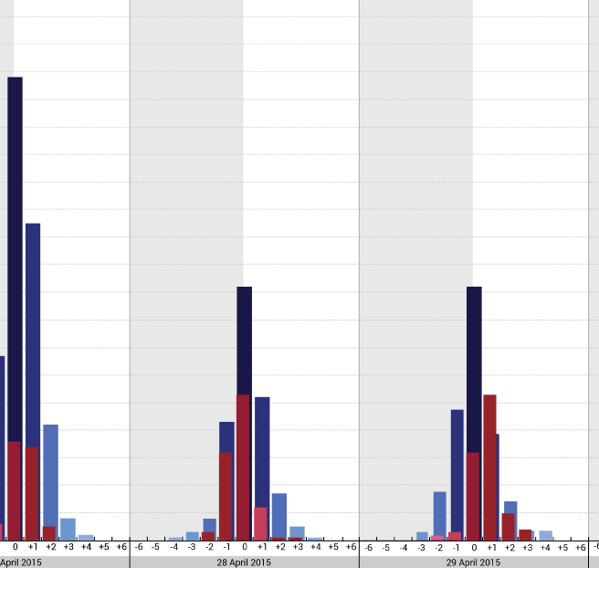
 In order to prove this Hypothesis, collections of sentiments were considered to have information on the different perception of Chinese people on Trump's sentences. The sentiments were collected from Twitter and Weibo during a specific period of time from May the 25th to April the 5th, the goal was to visualize the flow of perceptions recorded in the two social networks. The interesting elements that were providing relevant information for the research were the quantity of posts, the information about time and date in which they were published and the sentiment scale. The team decided to try different types of diagrams to find the solution that describes in a better way three level of information. The first attempt was about the representation with a Scatter Plot diagram, but for the visualization was not easy because the readable layer of quantity had interferences with the time distribution. The team decided to change the chart's typology. The Second attempt was to use the a 3d representation of the chart using the isometric view, but the issue that emerged was the representation of different values of data in the front were hiding the representation of data in the back. For this reason the team, after different experiments, decided to use a 3d diagram to have three different level of information for each social network in the same chart. The idea of the 3D model is to have the value regarding the time on the X axis, the scale of sentiment's score on the Y axis and the quantity of posts on the Z axis. The area in which the reader could read the analysis is composed by a repetition of bar chart elements for each day. For each day there are two different elements that represent the tendency of posts of Weibo and Twitter.
download pdf full datastory || download the full pdf with visualisations
Project by Carl Fredrik Beckius 帅小白 | He Zhaoyang 何兆阳 | Bai Hui 白慧 | Manuel Roßner | Beatrice Rizzi | Catalina Villa Melendez
back to top


