Changing Trends
Overview on Religious Developments in Asia from 1970 to 2010
All our team member are people concerned with socio-political problems, and considering current situation on international arena, war in the middle east and a refugee flow to European countries, we decided to draw our attention on religion, and monitor and connect some trends in religious developments around the globe. We decided to focus on one or two main trends, but the question was what are these trends? Is it, for example true, that there was a spread of Islam in the last few years, and that people generally became more religious over the last decade? To answer these questions we needed information.
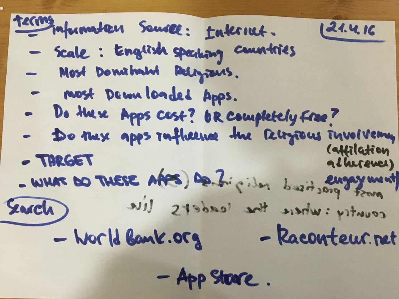
First day sketch about the choice of the topic and related questions

We started with a search on data that was already available online and found a website of the Association of Religion Data Archives. The ARDA is a reliable information source funded by Pennsylvania State University, USA. It is a free source of online information related to American and international religion. Over 750 surveys, membership reports, and other data collections are currently available online and mostly free of charge. The dataset we found was covering all countries in the world with earliest 1945 to 2010, with a 5 year period. It covered over 30 larger or smaller religious movements and their sub movements and other religions, and non-religious population, as well as a total population of each country for each period of time. Apparently some countries started collecting data on religions affiliations of its population later then other, because for some countries, like, for example, Cuba, data presented in the set only starts in the year 2000. It is questionable though, if this data can be relevant for monitoring the global trend after the WWII. The other approach could be to focus on the New History and focus on the years that are available for all countries. This would mean however that we would have to reduce our time period to years 2000-2010. The other relevant issue in this dataset was that the information given was very detailed, focusing on each small religious movement and subdivision. Considering our main goal, we decided to skip irrelevant data (due to numbers were really small) and focused on main movements only, and had to group up smaller religious movements into larger clusters.
After this we had an outcome of data for all countries, still in all available time periods, but combined into main religions - Islam, Christianity, Judaism, Hindu and Buddhism, and other religions. We also had data for non-religious population, as well as the total population of each country for each period of time. Unfortunately the data were quite messed up, so before starting analyzing them, we had to learn some tools to clean up the Dataset and be able to start monitoring the trends we would like to visualize, like OpenRefine. First of all we had to give the entire dataset the correct format: we had to erase the commas in the numbers, make them appear as numbers and recognize the date. Once we solved all those technical problems, we were ready to use our data into some software to get some visualization and to do that we tried with Raw. But we were not able to get to some good solutions. The point here was that we had such a big amount of data that it was impossible for us to get something out of it. Everytime we tried with a different visualization, even if the software recognize the data as correct, the visual result was too complex and confused and does not allow us to get something out from those trends.
So we decided to split the dataset and create six smaller ones, each one collecting the data of a continent, in order to have more manageable amount of data. We organize the data according to the years, to be able to see how many people for each religion lived in the different continents along time. Another step was to decide if to use quantities (real numbers of belivers for each religion) or percentages (which percentage of the population follow a specific religion).
We started to work with percentages but soon realize that something was going wrong.
 To test our work we did the same charts both with numbers and percentages and obtained two different charts: the first one with numbers was much more intuitive to understand. The point is that percentages relate to the total population of a state, that is a growing quantity. For this reason, even if a percentage remains the same across the years, it is actually representing a different (and bigger) amount of people. For example 8% of jewish people on a population of 2.500.000 people do not corresponds to 8% of jewish people on a population of 4.200.000 people. We decided to work with absolute numbers because they give more immediate and comprehensible charts and it allows us to work with them more easily.

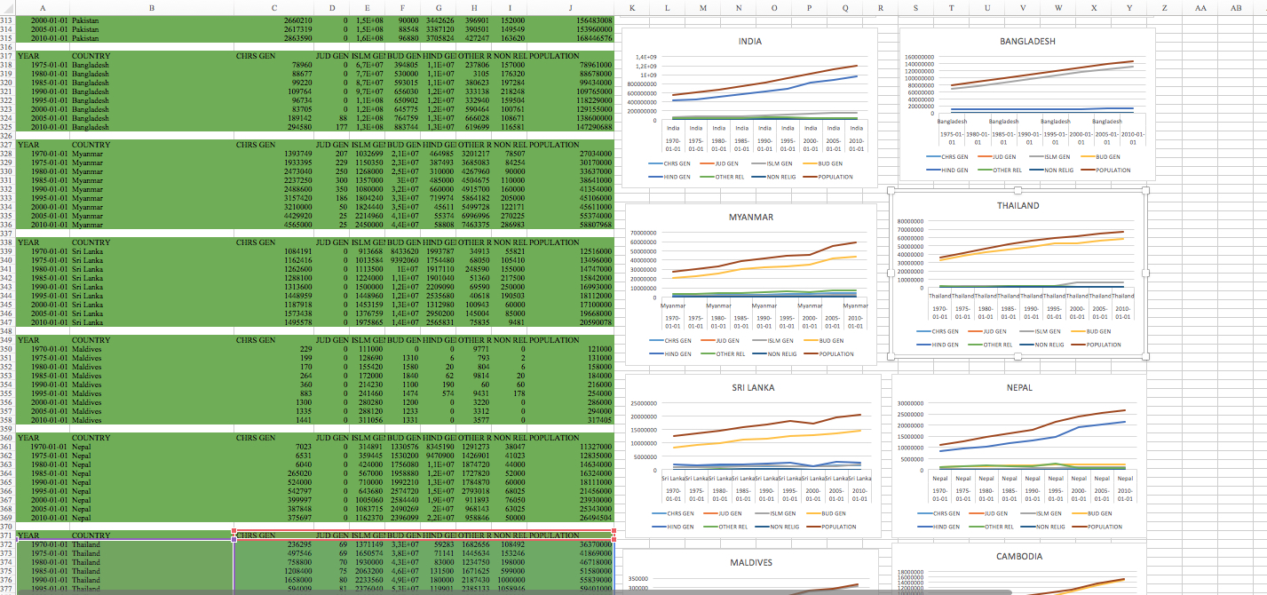
Once we had our smaller datasets, we were able to develop some very basics charts with Excel that allow us to compare the changes of the different religions in the continents between 1945 to 2010. Analyzing these data we could identify that in most of the continents (Europe, North and South America, Africa and Oceania) there is a main religion (basically Christianity) that outnumber the others. But on the other side, Asia is a very interesting case, with lot of interactions between the different lines. We chose to focus only on Asia since this case is much more complex compared to those of the other continents and so can be more interesting to analyze, going also in the details of some national state events. Before starting with the detailed analysis of the continent, we checked the data set and decided to focus in the period between 1970 and 2010 because in this way we have all the data of all the countries that compose the continent and so our analysis can be more precise.
The visualisation
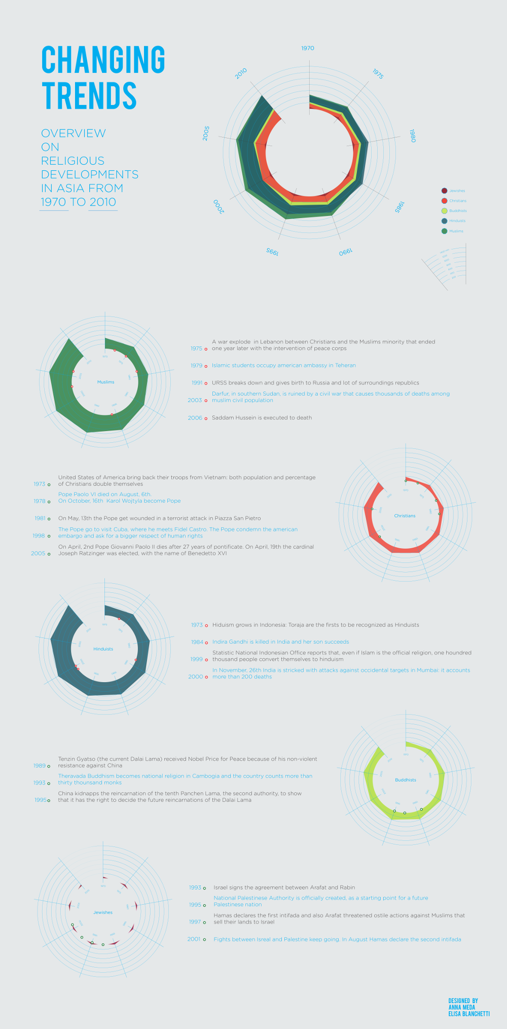
The visualization we developed mainly focuses on showing the changes and development of the five principal religions in Asia. We tried to compare all of them in a first chart, the can easily show the proportions among them, their relations and the different growth they went through. Then we added smaller charts that focuses only on one religion. We used these smaller charts to give a more precise idea of each religion and also to highlight on them some key historical happenings that could have influenced the trends.

Project by Anna Meda | Elisa Blanchetti | Alla
back to top