Cut the Fruits!
The Difficulties of Choosing the Topic
It has been a quite long journey for us to decide our topic. We went from “National Anthem” to “e’leme”, and finally decided to do the topic of “fruit”.
1. National Anthem At the very beginning, we did brainstorming to think about different topics that we are interested in, and we reached an agreement that we all want to do something quite interesting. Du posted a link with the musical notations of the all the national anthems around the world. So, as music lovers, we decided to push it a little bit further to see if “national anthem” could be our topic. The first step is about collecting the data. We began to set up our database by collecting all the musical notation as well as the midi files of the 201 national anthems all around the world. Then we extracted the information about the tonality, time signature, rhythm as well as the lyrics of each song, and organized the information into an excel form. The second step is about finding connections. We wanted to see if there could be any connection between the tonality, time signature, rhythm and lyrics of the national anthems with some historical or economical factors of each country since we noticed that the 3/4 time songs are often used by European developed countries with fewer wars and higher GDP… on the contrary, the 1/4 or 2/4 time marching songs are often used by developing countries with a tortuous and difficult path in modern history… But we stopped later since it was a little too subjective to analyze the data and find the connections. Also, the national anthems have been performed by different people with different speeds or tonalities or even genres, which means our data is not strong enough to support the design later, and that was why we decided to change the topic.
2. E’le me 饿了么 Being afraid of losing our way in the forest again, we decided to ask Francesca if she could provide us some big and reliable dataset. Francesca suggested us to meet with Neema, a very nice and cute exchange student from America who major in Statistics to help us to get some data from “e’leme”, a very popular App for ordering takeaway food in China. The brainstorming with Neema helped us to produce many provoking ideas, and we were especially interested in the points of people’s behaviors while using “e’leme” such as who how will the target audience use the “Red Pocket”, also the sales and the sending fee food among different restaurants… We were also checking the data related to the environment background, such as the climate changes, the locations, and provinces, to see if there could be any connection between these data and “e’leme”. However, as the beginners of data visualization, we did not know that how hard web data crawling was. The red pocket information could be the commercial secret of “e’leme” and the other data were also so hard to grab, which means, we might have to change the topic again! Well, although it would not be “e’leme”, to save our time and effort, we agreed to just focus on foods this time. Food is also a big subject with too much information. We were still confused about the things to do and the data sources. So, during one midnight, Han went to data crawling websites like GoSeeker and Bazhuayu, and spent several “2 yuan”, “5 yuan”, “10 yuan” to download the data grabbed by other people, and finally got a ten-yuan-dataset called “Chinese food ingredients (2014)” (《中国食物成分表(2014)》), which then became our first the data source for the final work.
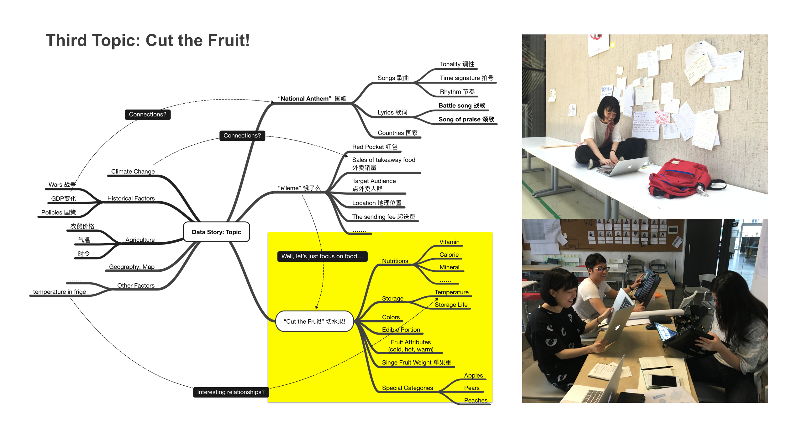
3. “Cut the Fruit!” In the dataset of “Chinese food ingredients (2014)”, we found out that the fruit part was very interesting. You could see the differences between fruits in vitamin, calorie and mineral nutrition. Also, the 24 kinds of pears, 17 kinds of apples, and 12 kinds of peaches normally seen in the market in China was a good point to explore too… So, we decided to visualize the data of fruit, and gave our group a name called “Cut the Fruit!” which means we would select the data of fruit and analyze them to reach a result.
Get the Raw Data and Information
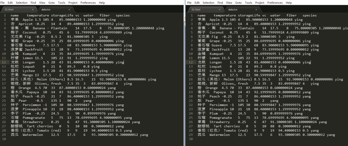
Just as said before, we got our first data set on some data-crawling websites like Bazhuayu, GoSeeker and Dataduoduo. However, we thought that these were not enough. To make sure that the data are reliable, we searched for some similar dataset through official channels. We tested the accuracy of our dataset by comparing what we have with a published book from the library “Chinese Food Ingredients (2002)” (the reason of why we didn’t use this directly is because it is only paper version and might cause too much effort to retype the data by ourself), and we checked all the items of fruit and correct a few possible mistakes.
We also went to see the website of FAO (United Nations Food Agriculture Organization) and find the information about the most suitable storage temperature and storage life of each fruit. (Recommended temperature and relative humidity for fruits and vegetables and the approximate storage life under these conditions: http://www.fao.org/docrep/008/y4893e/y4893e06.htm ). The CNYK(China National Knowledge Internet) is also a reliable place to get the data. We researched about the 24 kinds of pears, 17 kinds of apples, and 12 kinds of peaches through CNYK, by reading the papers such as《鲜食苹果品质评价研究 (The fresh apple quality assessment) 》,《我国梨种质资 源研究概况及优良种质的综合评价 (The pear germplasm resources research in China)》,《桃果实品 质评价因子的选择 (The peach fruit quality evaluation factors)》. Besides the official channels, searching engines like Google and Baidu helped us with our data/ information collection too. We checked the 营养字典(yingyangzidian.com) and got the information of the ph value of each fruit, we checked the《食物属性一览表(寒性、热性、温性) 》to see the attributes (cold, hot, warm) of fruits. We also searched for files like 《中国冰箱制造的标准文件 (China's refrigerator manufacturing standard file) 》in order to find about the relationships between the storage conditions and the fruits.
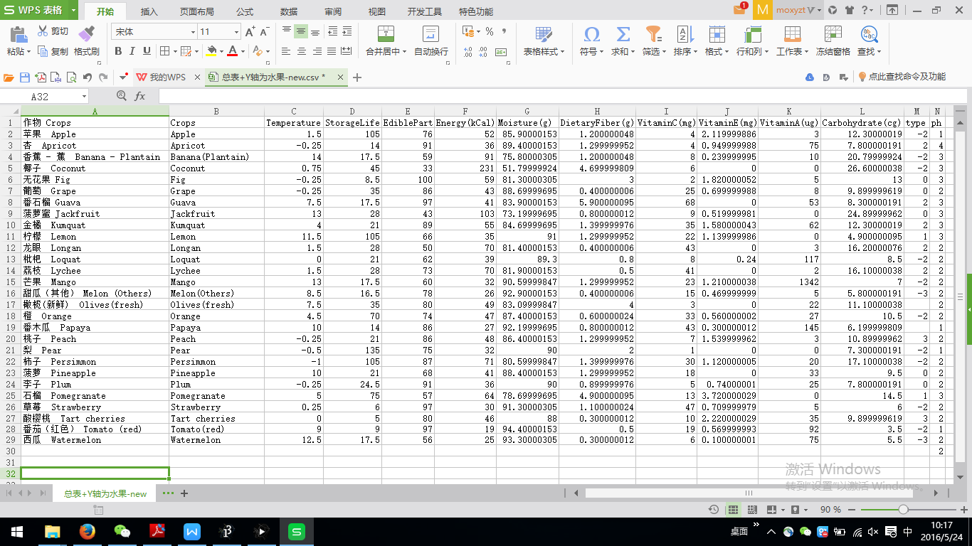
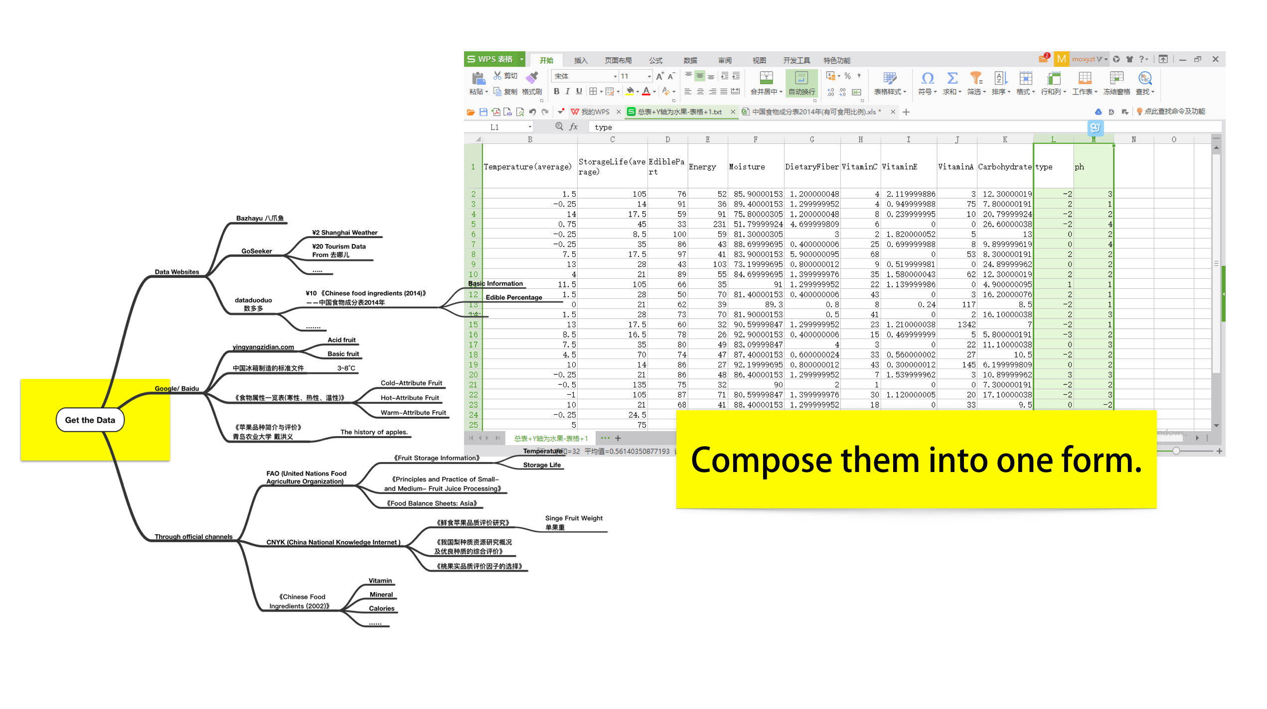 After all, we’ve got the nutrition information like vitamin, calorie and mineral contents and edible portions of fruits, we’ve got the suitable storage temperatures and storage life spans of fruits, we’ve got the colors and the cold/hot/warm attributes of fruits, and we’ve also got some more detailed information about the special categories of apples, pears, and peaches. We organized all these data and information from data-crawling websites, official channels and searching engines, and composed them into one excel form.
Play with The Data by Using Different Tools
Now we’ve got our dataset! The next step is to play with the data by trying different tools. We first tried all the online visualization tools provided by Francesca, such as RAW. Through exploring by online tools, we’ve got some interesting facts among fruits, such as coconut contains the maximal calories and the minimal edible portion, mango contains the highest vitamin A, and the longan is full of vitamin B… Also, interestingly, there are differences in nutrition facts among the 24 kinds of pears, 17 kinds of apples, and 12 kinds of peaches.
Our Data Visualization of Fruits
Now we’ve got our dataset! The next step is to play with the data by trying different tools. We first tried all the online visualization tools provided by Francesca, such as RAW. Through exploring by online tools, we’ve got some interesting facts among fruits, such as coconut contains the maximal calories and the minimal edible portion, mango contains the highest vitamin A, and the longan is full of vitamin B… Also, interestingly, there are differences in nutrition facts among the 24 kinds of pears, 17 kinds of apples, and 12 kinds of peaches.
In our process of data visualization, Han is mainly responsible for collecting and integrating the data and creating the basic charts for the later design with tools, Chichi and Rey are responsible for the coding part and they designed the first and second visualization by Processing (the Storage+X Bobble Chart, and the Storage-Color Rectangle Chart), and Du is mainly responsible for the overall style of our work and also the design of the third part with Adobe Illustrator (the Specific Fruit Radar Chart).
Part 1. Storage+X Bobble Chart
Since we’ve tried our data with websites like RAW (http://raw.densitydesign.org) and Google Charts (https://developers.google.com/chart/?hl=en ), we’ve got a basic understanding of our dataset, which contains a large member of factors of the fruit such as the energy, carbohydrate, Vitamin A/B/C/E, dietary fiber, edible portion, PH value, Yin&Yang and so on. Rey and Chichi knew some coding before, so we thought that we could let them push their coding skills a little bit through this projects and decided that we would do some interactive visualization. Rey tried our data with D3 first, but she met problems like failing to add the names of that fruit to each circle represents the fruit for some reason… However, Rey didn’t give up exploring and succeeded to finish the visualization by using Processing.
We have got the raw data of 28 kinds of fruits, while we looked at our raw data and tried to figure something out for all those numbers. The data are complex and diversity, so if we visualized them in one interface, if might be confusing. So we decided to guess the relations of these attributes, and Neema helped us to analyzed the data with “R”… Well, we realized that the possible relations of the attributes are weak, which means, instead of trying to find the connections so hard, we’d better present the fruit attributes in a more direct way. We chose to use the colors of the circles to represent PH value, which is popular in Western countries, and the Yin&Yang on the contrary, which is popular in Eastern countries, especially in the field of Chinese medicine. Also, we realized the most fruits are alkaline(basicity), and we’ve got their PH values which could be put into our visualization. However, if we use the standard colors of the pH values (like the picture below), the colors would all fall in the range of blue. In order to make it more apparently, we define the colors by ourselves, with three colors from orange to Yellow, and then to blue. According to Eastern traditions, the forces of Yin&Yang are energetic qualities that shape everything in the universe, including our health. The Chinese symbol for Yin is coolness, dampness, and darkness, relative to the Yang qualities of warmth, dryness, and light. Yin foods tend to be cooling or moistening, on the other hand, Yang foods tend to be warming and drying. This has less to do with the actual temperature or moisture of the food and more to do with its “energetics". Boiled spinach, for example, is cooling and moistening, as is baked tofu. Chilled wine is warming, as is roast beef. Toast, while dry to the touch, actually moistens the body. The effects of such food qualities on health have been observed for thousands of years. Your acupuncturist is trained to balance your body's constitution. By observing your body and understanding the energetics of food, you can make food and activity choices to speed your body's healing progress. Since the theory is from “Tai Chi(太极)”,Rey defined to use black and white to represent Yin&Yang. Our final output of the Part 1 looks like the picture below.
Part 2. Storage-Color Rectangle Chart
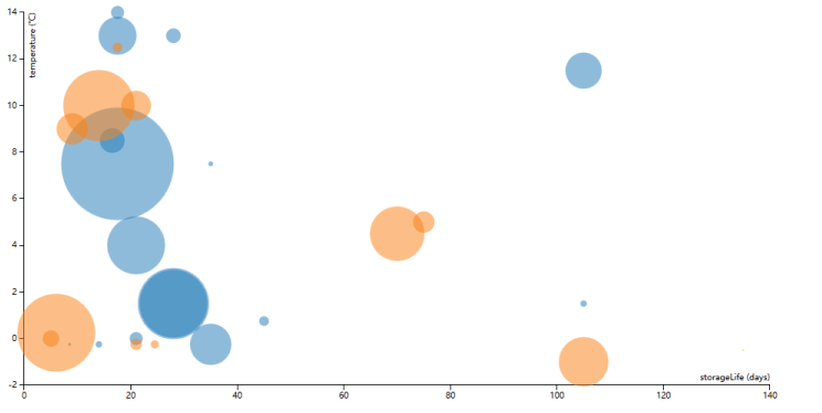
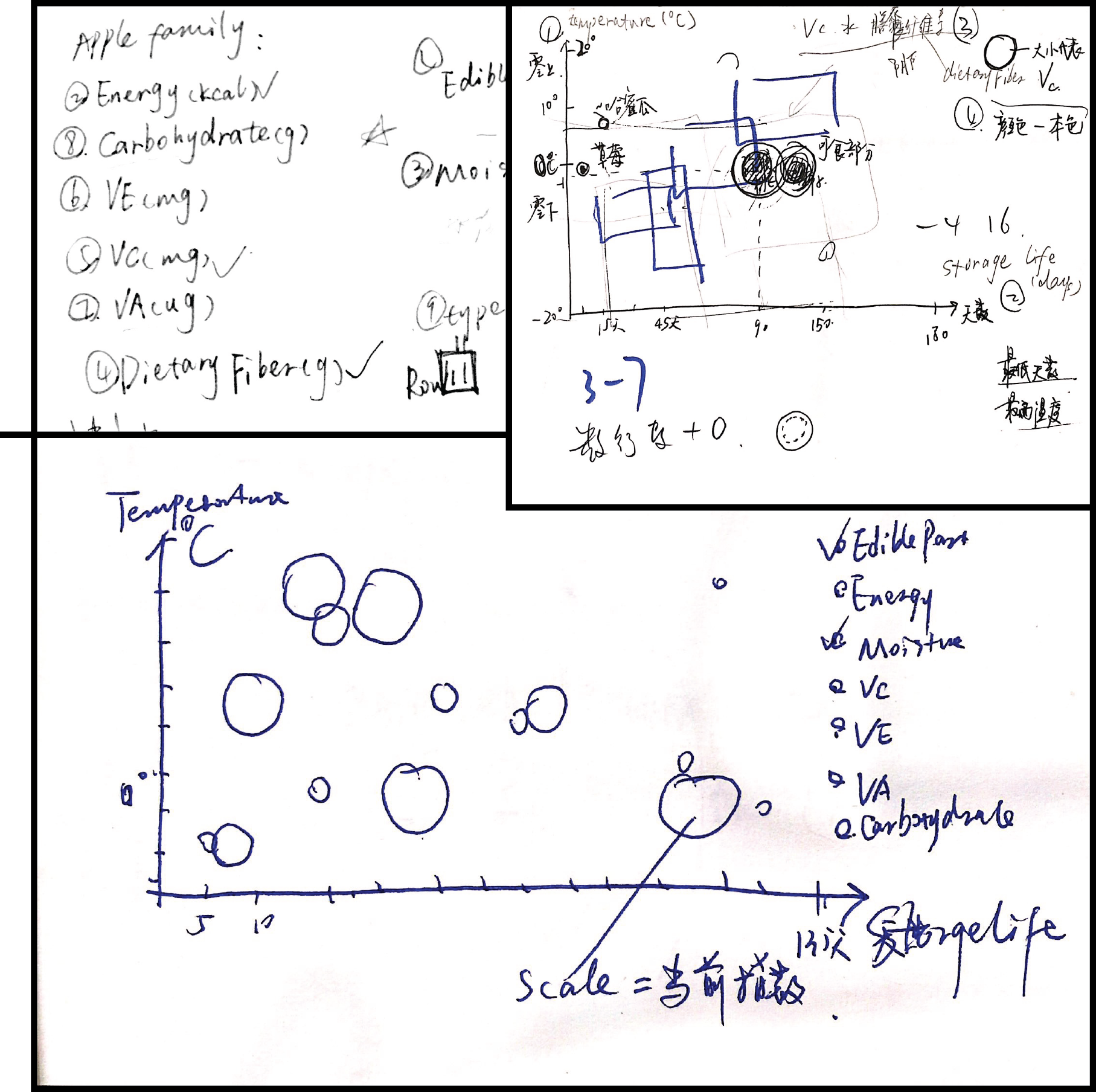
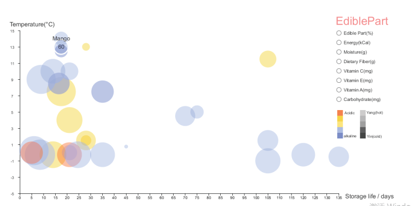
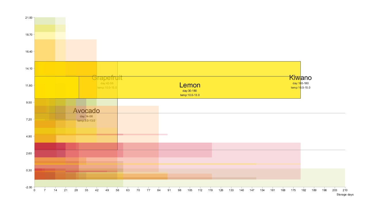
Chichi is mainly responsible for the creation of part 2. In this part, we created the work by using a part of our dataset, which contains 8 parameters about the storage information of around 70 kinds of fruits come from FAO, from which we noticed that the humidity condition data were quite similar and the more differences are in temperature condition and storage life. The “temperature” and “storage life” might be considered as the relation of “cause and effect”, so we decided to visualize these two parts. Then we asked ourselves what can be seen from the two categories? Our answer is that it could probably tell us the capability of different fruit can keep fresh so we can choose the best way to preserve them. So Chichi firstly thought about scatter plot may be helpful if we set the horizontal axis as “storage life” and the vertical axis as “temperature” like below.
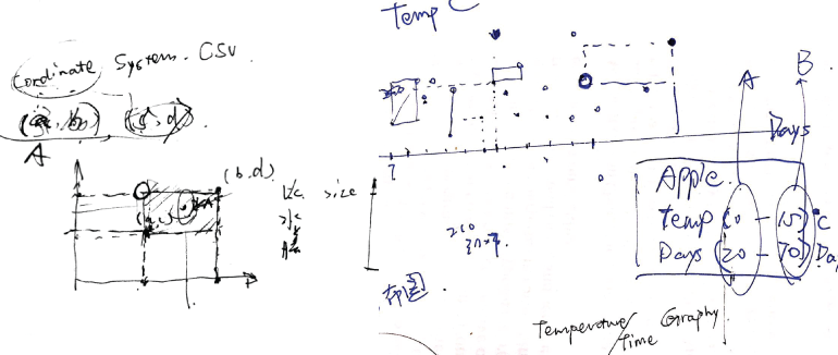 We worked on two scatter plot charts “max temperature-max fresh life”/ “min temperature-min fresh life”, then overlapped both of them and used the full circles and empty circles to make the difference. But the output seemed really confusing. We realized that “temperature” and “storage life” were present in pairs, which means a pair of the full circle and empty circle belong to a specific fruit. We should connect them instead of leaving them separately. At this time, the form of rectangles seems better than the form of circles! The areas of the rectangles represent the capacity of storage between different fruits. Chichi also thought the colors of the rectangles should have their meaning so he searched for all these fruits in Wikipedia and collected the outside colors of all the fruits then divided them into groups. However, Chichi still thought that there could be something missing... and luckily, we've got a standard file of Chinese refrigerator manufacturing and noticed that the refrigeration temperature is between 3 to 8 degrees, which is suitable for only some kinds of fruit. Thus, it could be really interesting if we add two lines to represent the refrigeration temperature so that people could know what kinds of fruit is should be put into the fridges while others are not. The final output of Part 2 then came out.
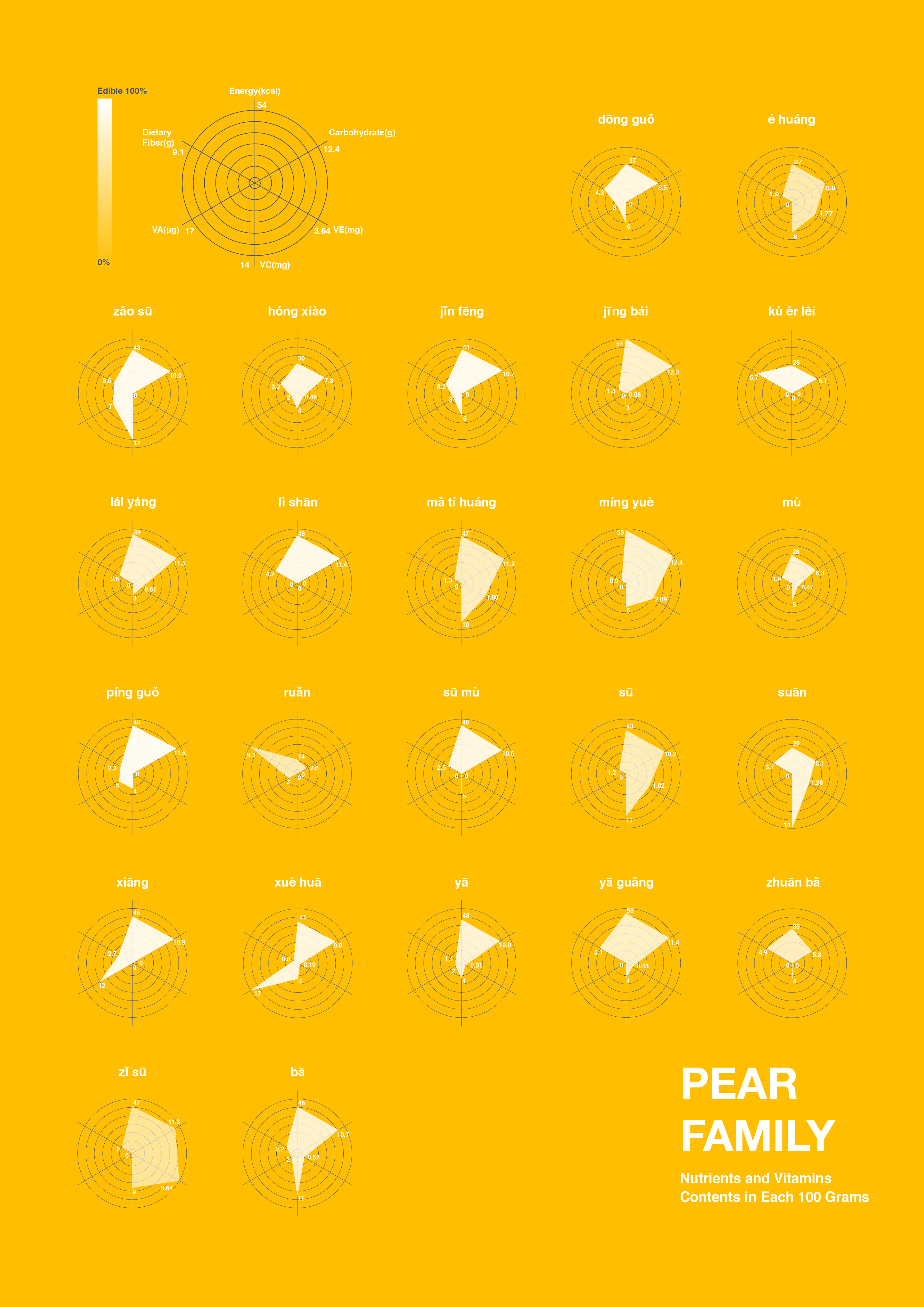
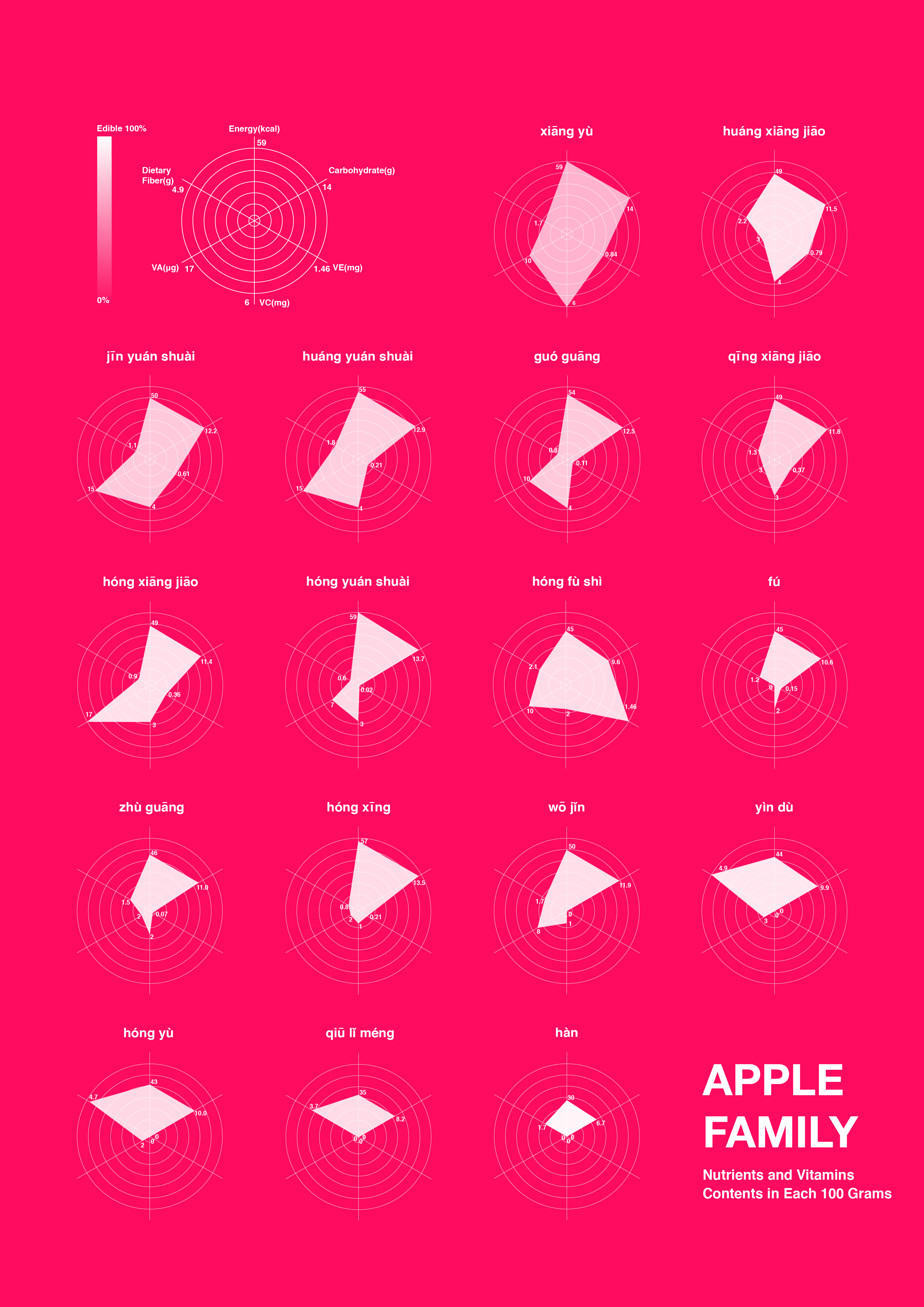
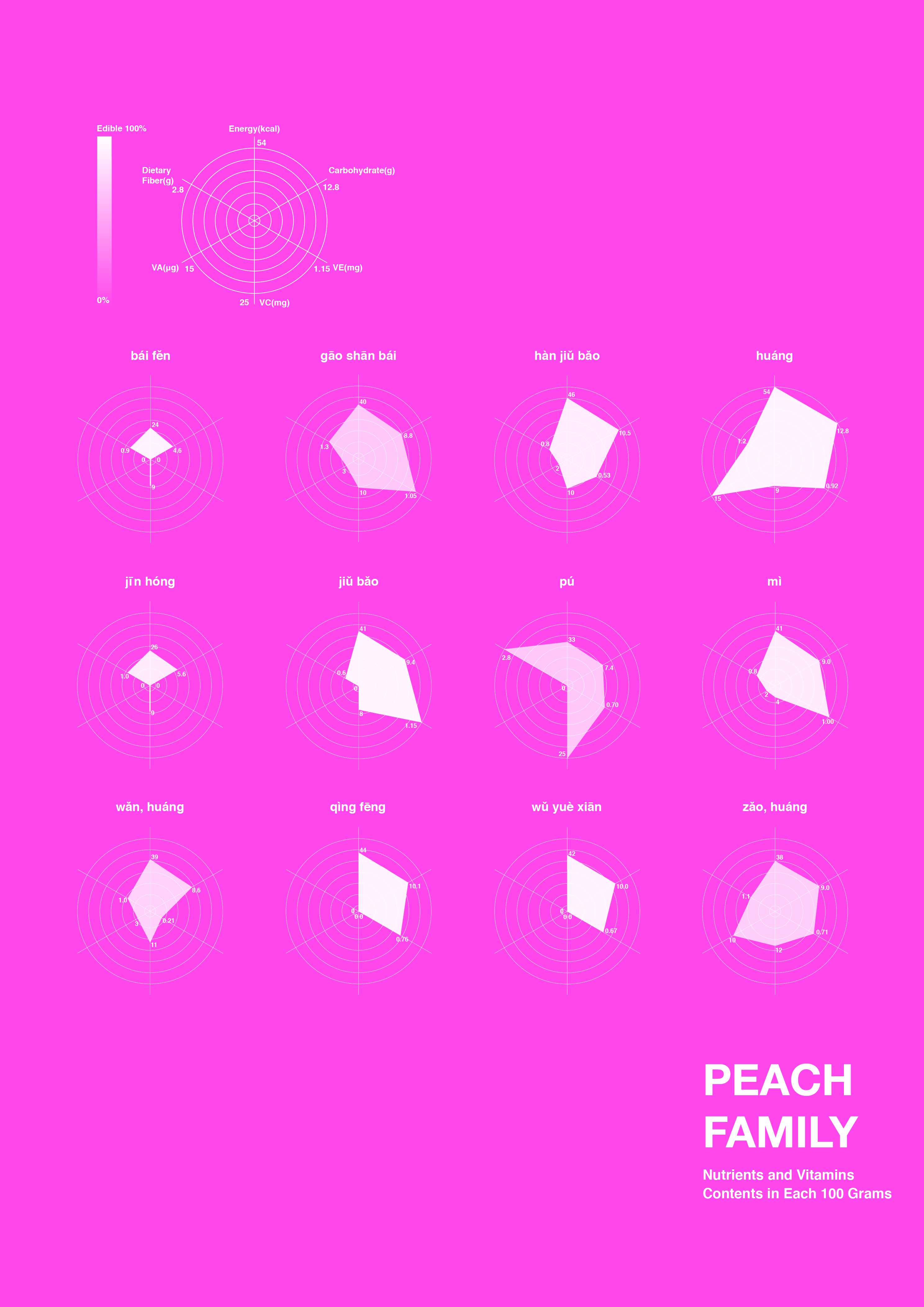
Part 3. Specific Fruit Radar Chart
The issue on specific fruits has been put forward since we want to provide a scientific guideline for the public to know the exact difference among those fruits. You may recognize that Fuji apples are crisp and refreshing while Red Star apples are soft due to your own experience. But you will never try hard to see how they vary in nutritional ingredients and have a clear recognition. Therefore, the third part of our fruits project aims at making a visible comparison among those fruits. Concerning the limited time we had, we selected three categories of fruits (apple, pear and peach) as the design targets from the database. A doubt later raised. Should we visualize all the data we had about those fruits? (i.e. energy, moisture, fiber, carbohydrate, vitamin and chemical elements) 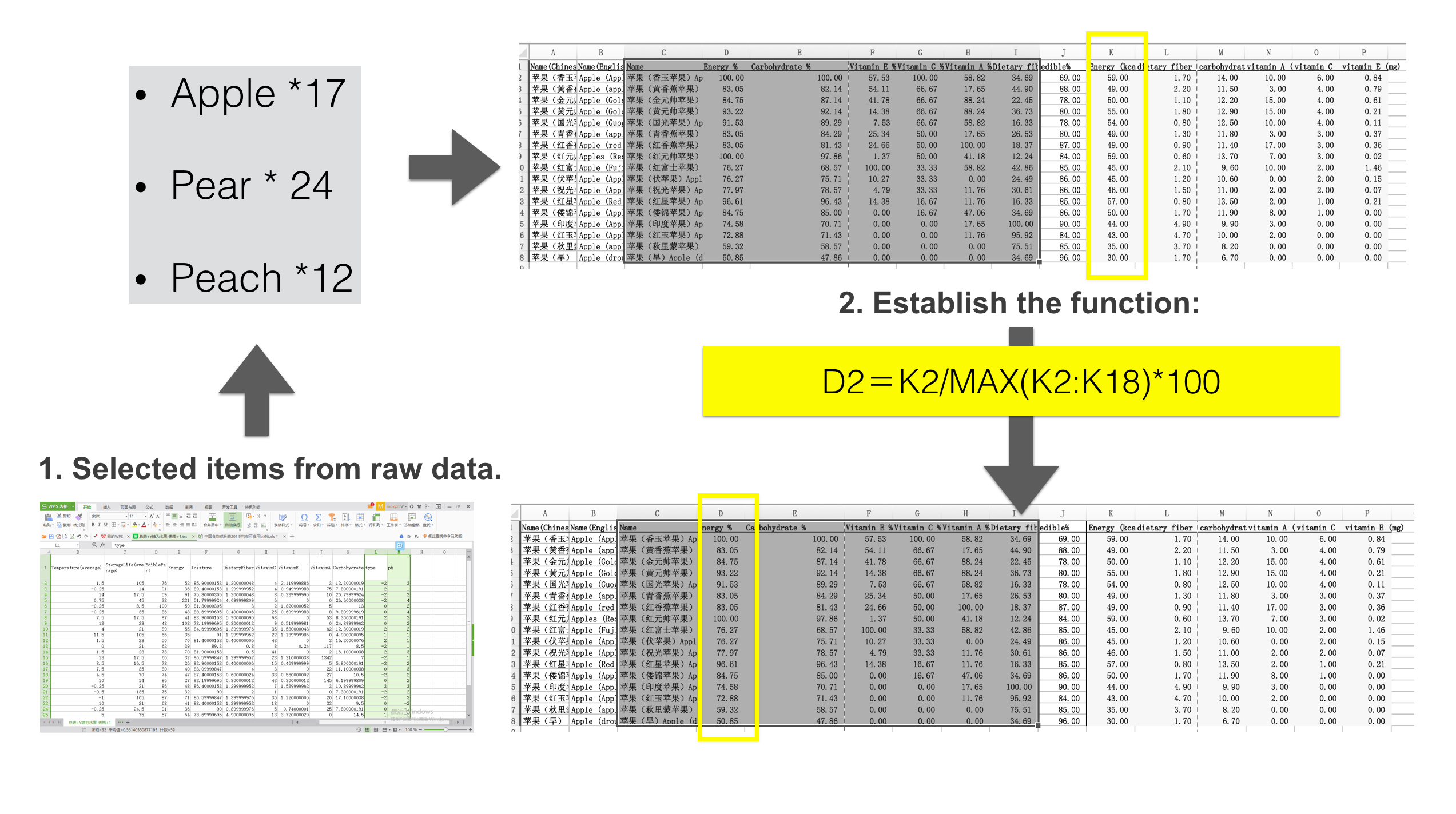 Chichi believed that all the data should be shown in order to form a comprehensive understanding. But Du and Han argued that only representative data could be put into the visualization, which would help maximize the differences and provide a direct identification about where they exist. The argument finally won by the two girls. After consulting her friend who was studying nutriology abroad, Du determined the issues that were usually used to evaluate the fruits. (i.e. dietary fiber, carbohydrate and vitamin A/C/E) Also, the data about energy and edible part were taken into consideration.
Data were ready and then we started to think about the design. It still remained a huge question about how to visualize the data and convey our ideas effectively to the public at that moment. We had three categories of fruits and each had various kinds while the evaluation contained different items. Han first tried the cumulative bar chart, gathering all the items together. But it turned out to be a failure since we could hardly read any detailed information from those graphs, especially the maximum value in each item. Fortunately, we thought of radar chart later, a useful tool to compare multiple data. Du did the attempt subsequently.
Chichi believed that all the data should be shown in order to form a comprehensive understanding. But Du and Han argued that only representative data could be put into the visualization, which would help maximize the differences and provide a direct identification about where they exist. The argument finally won by the two girls. After consulting her friend who was studying nutriology abroad, Du determined the issues that were usually used to evaluate the fruits. (i.e. dietary fiber, carbohydrate and vitamin A/C/E) Also, the data about energy and edible part were taken into consideration.
Data were ready and then we started to think about the design. It still remained a huge question about how to visualize the data and convey our ideas effectively to the public at that moment. We had three categories of fruits and each had various kinds while the evaluation contained different items. Han first tried the cumulative bar chart, gathering all the items together. But it turned out to be a failure since we could hardly read any detailed information from those graphs, especially the maximum value in each item. Fortunately, we thought of radar chart later, a useful tool to compare multiple data. Du did the attempt subsequently. 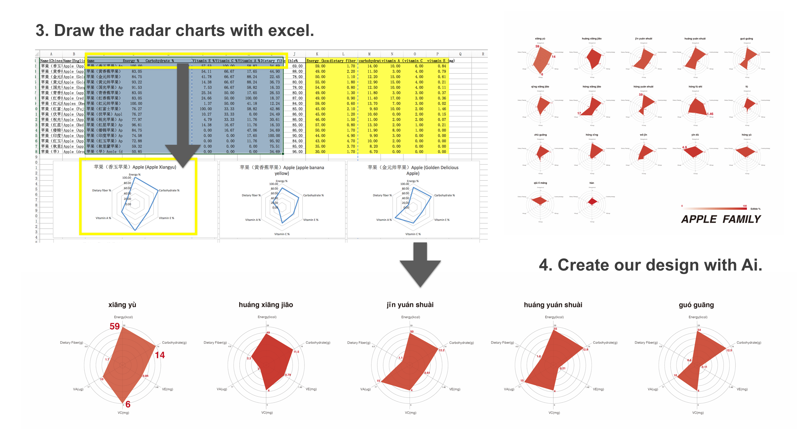
Each axis represented an item. (dietary fiber, energy, carbohydrate, vitamin E, vitamin C, vitamin A). The edible parts data, considered somehow subjective, were visualized in the form of opacity. It seemed that all things were going well. However, we soon realized that we lacked a criterion for the data. To be more scientific, it required some rules setting that the maximum of each item should be put in the outermost circle on each axis. Efforts were restarted. Han worked on Excel to produce some basic radar charts related to the issue and Du went on designing the new visualization. The differences among those fruits could be seen easily from the final output. Also, we’ve been thinking about the right colors to use. We made another version and finally chose to use the fruit’s colors as the background colors (like the picture shown on the right), since it makes the center part of our radar chart to be like “a bite on the apple/ pear/ peach”, and that’s fun! Our final output of the Part 3 looks like the pictures below.
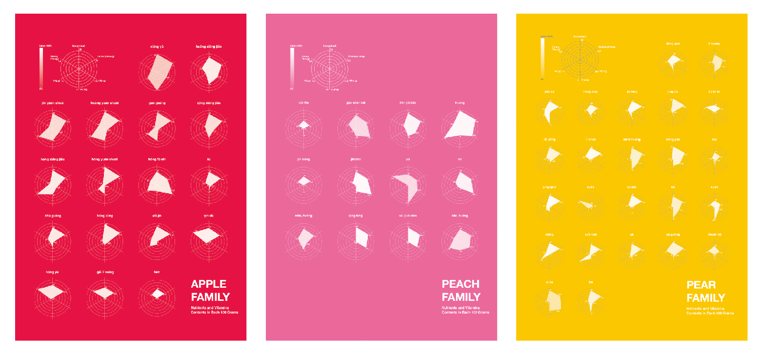
download the A2 posters pears | apples | peaches
Reflections
We know that our works are not perfect and we've been looking for ways to do better.
For Part 1, there might be a bug since the audience could not compare the Yin&Yang and the PH values at the same time. Maybe we would improve the reading experience by canceling the two option buttons and show the two factors directly on the circles. Maybe we would still use color as the expression for PH values, but for Yin&Yang, we could think about another solution such as adding symbols like "+" and "-" or simple shapes in the centers of the circles.
For Part 2, we set the horizontal axis with days every 7 days, however, we should just use “1 week” directly as the unit, instead of using “7 days”. Another problem is that there are large differences in storage days among fruits, some fruit with short storage life can not be shown detailed with a 210-days horizontal axis, so we need to divide the data graph into 3 scales, probably “1 weeks”, “1 month”, and “3 months”.
For Part 3, we then began to doubt if there was any connection to the places of origin. We found the relevant data about apples and divided the radar charts according to their location. The results seemed not optimistic, for there was no evidence from the visualization, supporting our assumption. Despite the disappointment, we will go on and try to make more fun out of the data.
We also want to say something about our data journey with twists and difficulties. We are often in a dilemma, where if we've already got a good idea, we may still fail for lack of a good dataset, vise versa. So we were thinking about the best way to make our design process smoother: maybe we could firstly find a reliable, official dataset, and secondly find a small but meaningful point from the dataset, thirdly we could expand and detail the topic even beyond the original data, and finally we finish our data visualization by revising our design constantly with the help of sketching, coding, layout, etc.
At last but not least, we are so glad that Francesca encouraged us to develop a good habit of keeping our data diaries, which is very helpful for not only this course. We appreciate our audience's comments and discussions. If you have some thoughts about our design and the process, please do not hesitate to contact us!
download the full pdf datastory + app coming soon
Project by DU Xiaojun | HAN Rui | JIANG Han | ZHANG Shiqi
back to top